
In the world of e-commerce, success isn’t just about having a great product or a well-designed website. It’s also about the colors you choose to represent your brand. Colors can influence online shopping behavior, emotional response, and, ultimately, conversion rates.
In this article, we’ll explore expert tips for harnessing the power of color psychology in e-commerce. We’ll cover topics such as the impact of color on consumer psychology, how to choose the right colors for your brand, and how to use color effectively in your website design and marketing. By the end of this article, you’ll have the tools and knowledge you need to color your way to e-commerce success.
Table of Contents
What is color psychology?
Color psychology is an essential concept in e-commerce, as it can affect how customers perceive a brand. Studies have found that up to 90% of snap judgments are based on color alone. Customers form an opinion about a product within the first 90 seconds of viewing, and the colors used play an integral role in this decision-making process.
Different hues evoke different emotions, such as trustworthiness, stability, or even danger. For example, the color blue is associated with authority and trustworthiness; this could be why many banks use blue for their branding. Similarly, yellow has been proven to trigger feelings of optimism and energy—perfect for businesses that want to promote their products as cheerful and exciting.
When it comes to e-commerce businesses specifically, color can be used strategically to attract more customers and make them feel comfortable making purchases through your site. The right combination of warm tones can create a welcoming atmosphere for shoppers who feel safe transacting on your website or app due to its professional look and feel.
Emotional response to color
Color holds a powerful place in our lives. It is often associated with strong emotions and can have an immediate impact on us. Certain colors have been shown to evoke specific reactions or feelings, and these responses to color can be used to create engaging user experiences that help drive engagement on e-commerce sites.
The psychological effects of specific colors are well-documented, with some having the power to evoke feelings of joy, trustworthiness, enthusiasm, or even alarm. The warm tones of yellow and orange carry connotations of happiness and charisma, while blues invoke a sense of calmness and serenity. Red is often linked with aggression and danger but also has associations with energy, confidence, and passion – perfect for creating a sense of urgency around promotions or sales events.
On the other hand, cool tones such as greens typically represent healthiness, while purples are often seen as luxurious or regal in nature. By utilizing the right combination of hues, it’s possible to craft an emotionally rich website experience that drives increased conversions by appealing directly to customers’ emotions.
Color symbolism and association
Color can influence how customers perceive products and brands, as well as evoke emotions that lead to conversions. For instance, blue is typically associated with trustworthiness and stability, while yellow evokes feelings of joy and optimism. Research also suggests that different colors are associated with different genders; studies have found that pink is more often preferred by women, while men favor blue.
Ultimately, choosing the right color combinations can help create a memorable brand identity and attract customers more likely to convert on your e-commerce site.
Additionally, color has been proven to increase brand recognition among consumers; in fact, research has suggested that up to 85% of shoppers base their judgments about a product on its color alone. Furthermore, the use of contrasting colors can make items stand out from competitors’ products; this may be especially beneficial for companies selling items in crowded markets like fashion or home goods.
By using the proper combination of colors throughout their website design–including logo design, e-commerce businesses are able to capture the attention of potential customers quickly and effectively.
Color preference and meaning
Studies have found that people associate different colors with different meanings, depending on their culture and personal experiences. Color preference also plays a role in the success of e-commerce businesses, as specific colors can influence customers’ decisions to purchase products or services.
For example, warm colors such as red and orange are often associated with feelings of excitement, energy, and strength. These colors may be used in an online store to create a sense of urgency or draw attention to essential elements. In contrast, cool colors like blue and green can help create a feeling of calmness or trustworthiness—which may be beneficial for viewing more complex products or services.
Similarly, neutral tones like gray and white can make website visitors feel comfortable while they explore the site’s offerings. Additionally, bright colors such as yellow are known for creating a cheerful atmosphere that encourages engagement from viewers.
Businesses should consider color psychology when designing their online stores in order to create an environment that resonates with their target audience. By understanding how color preferences affect customer behavior, companies can use this knowledge better to tailor their e-commerce strategies for more tremendous success.
How important is color psychology in ecommerce?
Color psychology is extremely important in ecommerce because it can have a significant impact on a customer’s perception of a brand, product, or website. In ecommerce, the goal is to create an engaging and positive user experience that encourages customers to browse, purchase, and return to the site. Color is one of the key elements that can contribute to this experience.
A color:
- Can impact a customer’s perception of a brand, product, or website
- Helps to create an engaging and positive user experience
- Encourages customers to browse, purchase, and return to the site
- Contributes to brand recognition and customer loyalty
- Can influence customer perceptions, emotions, and behaviors
- Helps to create a visually appealing and user-friendly website
- Can increase conversions and drive sales
- Creates a competitive advantage by differentiating your brand
- Can create an emotional connection with customers
- Helps to highlight key features or benefits of products
- Can be used to make call-to-action buttons stand out
- Can be used to create a sense of urgency or excitement
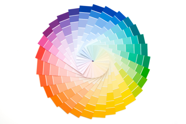
How each type of color is relevant to ecommerce?
| Types of Colors | Description | Relevance to E-commerce |
|---|---|---|
| Primary colors | Red, blue, and yellow. Fundamental colors that cannot be created by mixing other colors. | Useful for creating brand recognition and differentiation in ecommerce. |
| Secondary colors | Green, purple, and orange. Created by mixing two primary colors in equal parts. | Often used for branding and marketing materials in ecommerce, as they can create a distinctive and eye-catching look. |
| Tertiary colors | Colors created by mixing a primary color with a secondary color. Examples include red-orange, yellow-green, and blue-purple. | Can be used to create a more nuanced and sophisticated color palette for ecommerce branding and website design. |
| Warm colors | Red, orange, and yellow. Associated with warmth, energy, and excitement. | Effective for creating a sense of urgency and excitement in ecommerce, making them useful for call-to-action buttons and limited-time promotions. |
| Cool colors | Blue, green, and purple. Associated with calmness, relaxation, and serenity. | Can create a calming and trustworthy atmosphere for ecommerce, making them effective for product pages or the overall website design. |
| Neutral colors | Black, white, gray, and brown. Used as a base for other colors or to create a simple, understated look. | Useful for creating a minimalist and sophisticated look in ecommerce website design. |
| Complementary colors | Colors that are opposite each other on the color wheel, such as red and green or blue and orange. Used to create a bold, eye-catching look. | Can be used to create a high-contrast and attention-grabbing look for ecommerce branding and marketing materials. |
| Analogous colors | Colors that are adjacent to each other on the color wheel, such as red, orange, and yellow. Used to create a harmonious, cohesive look. | Can create a cohesive and visually appealing color palette for ecommerce branding and website design. |
| Monochromatic colors | Variations of the same color, such as light blue, medium blue, and dark blue. Used to create a subtle, sophisticated look. | Useful for creating a minimalist and sophisticated look in ecommerce website design, while still incorporating color. |
The role of color in building brand identity
Different colors evoke different emotions and convey different messages, so it’s important to choose the right colors for your brand. For example, blue conveys feelings of trustworthiness, peace and calmness, while red can create a sense of urgency and passion. By using the right combination of colors in your branding, you can create a compelling visual atmosphere that resonates with customers.
Having consistency between online and offline channels is essential when it comes to color – having a recognizable set of branded colors will help customers recognize your company quickly, no matter where they encounter it.
Furthermore, taking into account cultural associations with different colors can be especially useful when launching a product or service internationally – for instance green may symbolize wealth in some countries but bad luck in others. Understanding this allows brands to tailor their visuals for each market accordingly to maximize success.

Choosing the right colors for your brand
Color plays a vital role in branding, and it can be the difference between a successful brand and one that fails to make an impact. The right colors can attract customers, influence their emotions, and help create a distinctive image for your brand. When choosing colors for your brand, there are several factors to consider.
First, think about what message you want to communicate with your color scheme. Different colors evoke different emotions – warm colors like reds and oranges can be energizing, while cool colors like blues may create a sense of calmness or trustworthiness. Consider how your chosen colors will impact potential customers’ feelings when they interact with your products or services.
Next, think about how the colors might look together – don’t just pick two random shades of blue! A good rule of thumb is to choose no more than three primary colors as part of your palette; any more than that may appear cluttered or confusing to viewers.
Keep in mind that different colors look better on different backgrounds – lighter shades may get lost on dark backgrounds, while bright hues could clash against pale backdrops. Test out various combinations until you find something that looks attractive yet professional at the same time.
Understanding your target audience
It is essential to have a deep understanding of one’s target audience in order to leverage the power of color psychology. With this knowledge, brands can create designs and campaigns that emotionally resonate with their customers. Consider factors such as age, gender, cultural background, location, lifestyle and interests when crafting the message and visuals for your offerings.
For example, suppose you are targeting millennials in Japan who enjoy outdoor activities. In that case, you may want to use brighter colors like yellow or green which could be associated with fun and energetic lifestyles. Additionally, consider the preferences of each group; specific colors evoke different emotions depending on culture and demographics, so make sure to do your research before deciding on a palette.
It is important to remain consistent with your branding; pick two or three shades that will be used throughout all of your marketing efforts in order to ensure consistency and recognition from customers.
Researching color trends and meanings
Color trends and meanings can have a significant impact on the success of your e-commerce store. Researching the latest color trends and their associated meanings can help you make informed decisions for your online shop.
First, look into what colors are currently popular in fashion, interior design, and other industries. Many times, these same colors can be used to create an aesthetically pleasing website or product packaging.
Researching the psychology behind certain hues can also be beneficial; for example, blue is often associated with trustworthiness and security, while yellow is thought to promote optimism and positivity. When choosing a color palette for your e-commerce business, consider both current trends as well as their deeper psychological meanings in order to maximize success potential.
Creating a color scheme and palette
A color scheme and palette is an integral part of creating a successful e-commerce website. A cohesive, unified approach to the use of color will create an atmosphere that conveys your brand message, engages customers and encourages conversions. When designing your own color scheme, it’s essential to consider the psychology of colors and how they make people feel.
Different hues can evoke different emotions, so select tones that convey the right message for your products or services. It can be helpful to think in terms of primary, secondary and accent colors when creating a color palette.
Primary colors are those used most frequently throughout your site; secondary colors are used more sparingly, while accent colors add subtle bursts of energy with pops here and there. Keep in mind the ways you want visitors to interact with different elements on each page, as certain shades can influence user behavior, such as inspiring clicks or calls-to-action.
Testing and refining your color choices
Once you have narrowed down your color choices, it’s time to start testing and refining. Depending on the platform you are using, you may be able to run A/B tests on different pages or elements of your website with different colors to see which ones people prefer. If possible, also consider running focus groups or surveys to get feedback from potential customers about how they perceive the colors associated with your brand.
It’s important to remember that color psychology is a science and not an exact art form; there is no one-size-fits-all approach when it comes to selecting colors for your e-commerce site. Instead, use data from A/B tests and customer feedback as guidelines for making informed decisions about which colors will best represent your brand and create a positive user experience. Finally, take some time to look at other successful online stores in your industry and compare their color schemes for inspiration.
Using color effectively in website design
When selecting colors for a website, consider the meanings associated with each color. For example, blue often conveys trustworthiness, while red can be used to draw attention or convey urgency. Additionally, using contrasting colors can help create visual hierarchy and guide users through webpages by highlighting essential elements or call-to-action buttons.
It’s also essential to consider branding when selecting colors for a website. Incorporating brand colors into your website helps reinforce brand messaging and create consistency between all online touchpoints. Utilizing existing brand guidelines will ensure that you are creating a consistent user experience throughout your entire digital presence.
Incorporating color in your website’s layout and design
Consider the emotion you want your visitors to experience when they visit your site. Colors evoke different feelings, and it’s essential to choose colors that reflect the emotional response you want for your users. For example, warm colors such as red or orange tend to evoke excitement, while cool colors like blue or green evoke a feeling of calmness and trustworthiness.
Keep in mind how color affects readability on different devices and screens. While specific colors may look great on desktop computers with larger screens, they may not work well on smaller mobile devices where text is more difficult to read against a bright background. To optimize readability across all platforms, use light backgrounds with dark text or vice versa. Finally, make sure the palette you choose is consistent throughout the entire site so that visitors don’t feel overwhelmed by too many competing hues or shades at once.

Highlighting key elements with color
Choose shades that relate to your brand identity and put those colors front and center. Using one dominant color will ensure that your message comes across clearly; too many bright hues can create confusion or turn away potential customers. The bolder shades should be reserved for prominent elements such as headings or buttons; brighter tones are more likely to draw attention than muted ones.
Make sure all the colors you use are balanced with one another so that nothing stands out too much or fades into the background. Using complementary hues can help create visual appeal without cluttering up the page; for example, if you have a predominantly blue theme on your website, adding an orange accent could add vibrancy without distracting from other essential features.
Remember that color has emotional associations; warm shades like red may evoke feelings of passion and excitement, whereas cool hues like blue might signify trustworthiness and reliability. Choosing the right combination of colors can play a huge role in creating a successful business presence online!
Ensuring visual appeal and accessibility
Ensuring visual appeal and accessibility is essential for any e-commerce website. Color plays a critical role in the design of an e-commerce website and should be chosen with care. Colors can evoke strong emotions and influence user behavior, so choose colors that are impactful yet accessible.
When selecting colors, consider color contrast ratios to ensure they meet accessibility standards such as WCAG 2.1 AA guidelines. This ensures users with different visual impairments can easily navigate your site. Similarly, when working with text, make sure it has enough contrast for easy readability on both desktop and mobile devices.
WCAG 2.1 AA guidelines recommend that webpages have a color contrast ratio of at least 4.5:1 for standard text and 3:1 for large text (18 point or larger). This is to ensure that all users, regardless of their visual impairments, can easily read the content on the page without issue.
Additionally, WCAG 2.1 AA guidelines require that all non-text elements in a webpage have sufficient contrast as well – meaning they must be distinguishable from each other and not blend into the background. Finally, these guidelines call for proper foreground/background combinations, which will make sure there is enough contrast between them and also reduce eye strain and fatigue when viewing the website. Overall, by following these guidelines, webpages will be more accessible to everyone while making it easier to parse information presented on them.
It’s also important to choose colors that reflect the brand identity of your business or product. Colors like blue are known for being calming while red encourages urgency; black often symbolizes sophistication and luxury; green indicates naturalness; yellow implies optimism; purple represents creativity; pink stands for femininity—and these associations can help determine how customers perceive your products or services online.
Balancing color with other design elements
Balancing color with other design elements is critical for creating effective e-commerce designs. The colors you choose should not only evoke emotion, but also blend together harmoniously to create a pleasant experience for the user. To achieve this balance, you must consider the impact of all visual design elements, such as typography, texture, shape, and size.
When selecting colors for your e-commerce website or app design, think about how they interact with each other and the environment in which they will be seen. For example, intense colors like red can grab attention, while softer tones like pastels can provide a more calming effect.
Consider how different hues will look when placed side by side – will they complement each other or clash? Additionally, think about how the contrast between lighter and darker shades can draw focus to specific areas of the page or product images on display.
Finally, when adding text to an image or background color, remember to use complementary font colors that stand out against their backgrounds without being too distracting – both light fonts on dark backgrounds and vice versa work well in this case. With these tips in mind you can easily create cohesive visuals that make users feel comfortable browsing your products and ultimately converting into customers!
Using color in marketing
Color plays an essential role in marketing and e-commerce, as it can evoke certain emotions that drive consumer behavior. For example, shades of blue are often used to promote peace and security, while red is associated with power or excitement. When choosing colors for your website or marketing materials, be sure to consider the message you want to send.
Studies show that people react more positively when a specific color is used for buttons, headers, or other clickable elements on a web page. It’s important to note that the colors you choose should match the overall style and branding of your site; don’t just pick any random color without considering how it fits into your larger design scheme.
Think about how different colors will look on different devices—for example, some colors may not appear as vibrant on mobile as they do on desktop browsing.
Applying color in your marketing materials
Research has shown that color influences customer decisions and affects their emotions, so it is essential to consider how best to utilize color for maximum impact. By understanding the psychology of color and its effects on customers, businesses can create effective marketing campaigns that resonate with their target audience.
The first step in applying color in your marketing materials is choosing the right colors for your message. Different colors evoke different emotions, so selecting the right ones will determine how customers interpret your messaging. For example, blue typically conveys trustworthiness and reliability, while yellow represents optimism and joy.
Before introducing multiple colors into a design piece or advertisement, consider if there are any cultural implications associated with particular hues, as this could affect how customers perceive your brand message.
Finally, keep in mind that too much of one color or too many different shades can be overwhelming to viewers and detract from the message you are trying to convey. If possible, limit each design element or advertisement to two or three moderate shades — this will help visitors stay focused on what matters most: your product or service!

Using color to evoke specific emotions and responses
When selecting colors, consider what message you want your brand to convey. For example, blue can give a sense of trustworthiness and loyalty, while yellow can bring out feelings of joy. Reds are often associated with urgency or passion, making them great for promotional campaigns like limited time offers.
Green is commonly used for eco-friendly products as it symbolizes nature and growth. Additionally, neutral tones such as gray and white act as a blank canvas that can be used in combination with brighter shades for maximum effect.
Keep in mind that color psychology isn’t an exact science but rather more of an art form; there are no hard and fast rules on how people will interpret the colors they see online. Ultimately, it’s up to you to experiment with different combinations until you find something that resonates with your target audience.
Maintaining consistency in your branding
Sticking to a color palette, typography and design elements will help reinforce your brand’s image among customers and further develop recognition for your business. You should also stay consistent with the language you use, both in written content and in visuals.

In order to maintain consistency, start by creating a style guide that outlines all of the components of your brand, such as logo size variations, font types/sizes/colors, photography styling and tone of voice. Then be sure to review this from time-to-time and make necessary updates as needed.
Be sure to communicate this style guide across departments so that everyone is on the same page about what represents the brand best. This will help ensure that any new content created is consistent with your existing branding so customers can easily recognize who you are no matter what platform they encounter you on.
How to decide which colors suit your brand or audience?
The choice of colors that suit a brand or audience depends on a variety of factors, including the brand’s identity, target audience, industry, and marketing goals. In this section, businesses should consider their brand values and how they want to be perceived by their audience.
For example, if the brand values energy, excitement, and urgency, warm colors like red or orange could be a good fit. On the other hand, if the brand values trust, reliability, and calmness, cool colors like blue or green could be more suitable.
It’s also important to consider the target audience, as different age groups, cultures, and regions may have different associations and preferences when it comes to color.
Younger audiences may respond more positively to bright, bold colors, while older audiences may prefer more muted, subtle colors. Similarly, different cultures may have different associations with certain colors that should be taken into account when targeting a global audience.
Another factor to consider is the industry in which the business operates, as certain colors may be more commonly used or expected in a particular industry. For example, financial institutions often use blue to create a sense of trust and reliability, while eco-friendly brands may use green to emphasize their commitment to sustainability.
Conclusion: Harnessing the Power of Color Psychology in E-commerce
Color psychology can be a powerful tool to increase e-commerce sales. Not only can colors influence how customers feel when they shop, but they also evoke certain emotions that make them more likely to purchase products. By understanding the basics of color psychology and applying them strategically, businesses can create an improved user experience that drives conversions and boosts their bottom line.
Frequently Asked Questions
What is color psychology, and how can it be applied to ecommerce?
Color psychology is the study of how colors can impact human emotions, perceptions, and behaviors. In ecommerce, understanding color psychology can help businesses choose the right colors for their branding, marketing, and website design in order to create a positive user experience and drive sales.
How can color impact an ecommerce site’s success?
Color can impact an ecommerce site’s success in a variety of ways, including improving brand recognition and loyalty, creating a positive user experience, and increasing conversions. Using color psychology can help ecommerce businesses choose the right colors for their site, as well as other marketing materials, to help differentiate themselves in a crowded market.
What is the role of color in branding for ecommerce businesses?
Color can be a powerful branding tool for ecommerce businesses, helping to create a distinctive brand identity that is instantly recognizable to customers. By using consistent colors across branding and marketing materials, customers can easily recognize the brand and develop a sense of loyalty towards it.
What are some examples of how color can impact ecommerce?
There are many examples of how color can impact ecommerce, including using call-to-action buttons in contrasting colors to make them stand out, choosing a color scheme that creates a visually appealing and user-friendly website, and highlighting key features or benefits of products using specific colors.
How can ecommerce businesses use color psychology to increase sales?
Ecommerce businesses can use color psychology to increase sales by using colors that create a sense of urgency, excitement, or trust. For example, using the color red for a “Buy Now” button can create a sense of urgency and encourage customers to make a purchase, while using the color blue for a product image can create a sense of trust and reliability.
What is the impact of using the same colors throughout an ecommerce website and marketing materials?
Using the same colors throughout an ecommerce website and marketing materials can help to create a consistent and cohesive brand identity that is easily recognizable to customers. This can lead to improved brand recognition and loyalty, as well as a stronger overall user experience.
How does color theory come into play in ecommerce?
Color theory is an important consideration in ecommerce, as it helps businesses choose the right colors for their branding, marketing, and website design. This includes understanding color associations, complementary colors, and the psychology of color, among other factors.
How important is color psychology for an ecommerce business focused on environmental living and sustainability?
Color psychology can be especially important for an ecommerce business focused on environmental living and sustainability, as it can help to create a positive user experience and emphasize the brand’s commitment to environmental responsibility. This might include using natural colors, such as green or brown, or colors that evoke feelings of calmness or relaxation.