Mobile devices have become integral to our daily lives, significantly influencing how we access and interact with digital content. As more people use smartphones and tablets to browse the web, website owners must ensure their WordPress sites are optimized for mobile users.
This guide covers everything you need to know about making your WordPress website mobile-friendly, including selecting a suitable theme, optimizing images, implementing responsive design, and more.
Key Takeaways
- Choose a Mobile-Friendly Theme: Opt for a lightweight, easy to navigate, and visually appealing across various devices.
- Optimize Images: Use image compression, mobile-friendly plugins, and responsive design to ensure fast loading times and quality display.
- Minimize Redirects and Page Load Time: Implement strategies like caching, image compression, and server request minimization to enhance site speed.
- Test Across Devices: Regularly test your site on different devices and screen sizes to ensure consistency and optimal user experience.
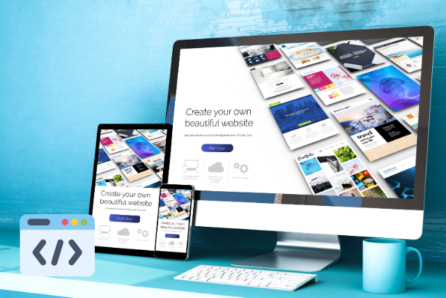
Choosing a Mobile-Friendly WordPress Theme
Selecting a suitable theme is the first step in optimizing your WordPress website for mobile users. A mobile-friendly theme ensures your site is accessible and appealing across different devices.
Factors to Consider:
- Load Time: Choose a lightweight theme optimized for quick loading. Themes with too many features can slow down your site, particularly on mobile devices with slower internet connections.
- Navigation Ease: Ensure the theme offers intuitive navigation that works well on touch-screen devices. Dropdown menus and clickable buttons should be large enough to tap quickly.
- Visual Aesthetics: The theme should look good on all devices, maintaining a clean, organized layout that adapts to different screen sizes.
Recommendations:
- Responsive Design: Ensure the theme is responsive, meaning it can adjust its layout based on the device’s screen size.
- SEO-Friendliness: A theme optimized for SEO can improve your site’s visibility in search engine results, which is crucial for attracting mobile users.
Optimizing Images for Mobile Devices
Images play a crucial role in the user experience but can also significantly slow down your site if not optimized properly.
Steps for Optimization:
- Image Compression: Use tools like TinyPNG or WP Smush to compress images, reducing their file size without compromising quality. This helps speed up page load times, especially for mobile users.
- Mobile-Friendly Plugins: WordPress plugins such as WP Smush or Imagify can automate optimizing images for mobile devices. Features like lazy loading can delay the loading of images until they are needed, improving overall performance.
- Responsive Design: Implementing responsive design ensures that images adjust according to the screen size. Use CSS media queries and responsive image attributes like
srcsetto deliver appropriate image sizes for different devices.

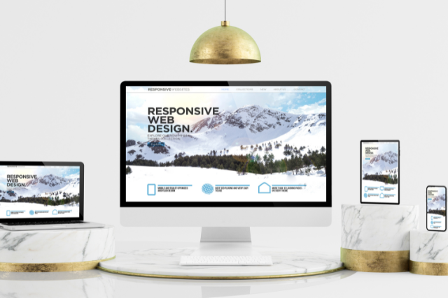
Use Responsive Design Principles
Responsive design is critical in creating a seamless user experience across different devices.
Benefits:
- Improved Accessibility: Ensures content is readable and navigable on smaller screens, enhancing the user experience.
- Enhanced SEO: Google prioritizes mobile-friendly websites in its rankings, making responsive design essential for SEO.
Implementation Tips:
- CSS Media Queries: Use these to adjust your website’s layout based on the device’s characteristics, such as screen size and orientation.
- Prioritize Content: Place the most important content above the fold to ensure it’s immediately visible to users.
- Optimize Navigation: Make sure menus are easy to access and use on mobile devices.
Minimize Redirects and Page Load Time
Page load time is a crucial factor in user experience and SEO. Faster-loading sites are favoured by search engines and appreciated by users.
Strategies:
- Reduce Redirects: Minimize the number of redirects on your site, as they can slow down load times.
- Optimize Images and Files: Compress images and use minified CSS and JavaScript files to reduce size.
- Enable Caching: Use caching plugins like W3 Total Cache or WP Super Cache to store copies of your site’s pages, reducing load times for returning visitors.
- Content Delivery Network (CDN): Use a CDN to distribute your website’s content across various servers worldwide, ensuring faster load times for users regardless of geographical location.
Optimize Your Site’s Navigation for Mobile Users
Effective navigation is crucial for a positive user experience, especially on mobile devices.
Best Practices:
- Simplify the Menu Structure: Avoid overly complex menus. A streamlined menu with clear, concise labels makes it easier for users to find what they want.
- Responsive Menus: Use responsive menus that adapt to different screen sizes, ensuring they’re accessible and easy to use on touch screens.
Prioritize Important Content and Calls to Action
Mobile users often have different needs and behaviours compared to desktop users. Prioritizing content and calls to action (CTAs) is crucial.
Content Hierarchy:
- Identify Key Content: Determine what content is most important to your mobile users and prioritize it. This could include product information, contact details, or primary CTAs like “Buy Now” or “Contact Us.”
- Above the Fold: Place the most critical content above the fold, where it is visible without scrolling.
Test Your Website on Multiple Devices and Screen Sizes
Regular testing ensures your website provides a consistent and optimal experience across all devices.
Critical Areas to Test:
- Consistency: Ensure fonts, images, and layouts are correctly displayed across different devices.
- Responsiveness: Check how well your site adapts to different screen sizes and orientations.
- Loading Times: Test the loading times on various devices and internet connections to identify potential issues.
Implement Mobile-Specific SEO Strategies
Optimizing your website for mobile search engines is crucial for attracting mobile traffic.
Mobile-Specific SEO Tips:
- Keyword Research: Focus on mobile-specific keywords, as search behaviour can differ between mobile and desktop users.
- Mobile-Friendly Content: Ensure your content is easily readable on smaller screens, focusing on concise, engaging, and easily digestible information.
- Meta Tags and Descriptions: Optimize meta titles and descriptions for mobile, keeping them short and relevant.
Utilize Accelerated Mobile Pages (AMP)
AMP is a technology designed to improve the speed and performance of web pages on mobile devices.
Benefits of AMP:
- Faster Load Times: AMP pages load faster, providing a better user experience.
- Enhanced SEO: Google often prefers AMP pages in mobile search results.
Implementation:
- Use an AMP Plugin: WordPress offers plugins like AMP for WP that simplify creating AMP versions of your pages.
- Monitor Performance: Regularly check the performance of your AMP pages to ensure they are functioning correctly and providing the desired speed improvements.
Regularly Monitor and Analyze Your Website’s Mobile Performance
Continuous monitoring and analysis are crucial to maintaining and improving your site’s performance.
Key Metrics to Monitor:
- Page Load Time: Slow load times can lead to higher bounce rates. Regularly check and optimize to ensure fast load times.
- User Behavior: Analyze how users interact with your site on mobile devices using tools like Google Analytics.
- Conversion Rates: Track conversion rates to see how effectively your site converts mobile visitors into customers or leads.
Frequently Asked Questions
How can I choose a mobile-friendly WordPress theme?
Choosing a mobile-friendly WordPress theme involves ensuring the theme is responsive, has lightweight code, and is compatible with various screen sizes. These features help improve performance and usability, providing a consistent experience across devices.
What techniques can I use to optimize images for mobile devices?
To optimize images for mobile devices, use image compression to reduce file sizes and lazy loading to load images only when visible on the screen. These techniques help improve page load times and enhance user experience.
What are responsive design principles, and how can I apply them to my WordPress website?
Responsive design principles involve creating a website that adapts to various devices and screen sizes. This includes using flexible layouts, scalable images, and CSS media queries to ensure the site is usable and visually appealing on all devices.
How can I minimize redirects and improve page load time for mobile users?
To minimize redirects and improve page load times, reduce unnecessary redirects, optimize images, enable caching mechanisms, and consider using a Content Delivery Network (CDN). These steps help streamline the user experience and reduce load times.
What strategies can I implement to improve my website’s navigation for mobile users?
Improve mobile navigation by simplifying the menu structure, using responsive menus, and ensuring navigation elements are easy to use on touch screens. This enhances usability and provides a better user experience for mobile visitors.
How can I implement mobile-specific SEO strategies?
To implement mobile-specific SEO strategies, conduct keyword research, optimize for mobile-friendly content and meta tags, and ensure fast page load times. Focus on creating a seamless and accessible experience for mobile users to improve search engine rankings.
Conclusion
Optimizing your WordPress website for mobile users is crucial in today’s mobile-first world. By following the strategies outlined in this guide—choosing a mobile-friendly theme, optimizing images, using responsive design principles, and more—you can ensure your website provides an excellent user experience across all devices.
Regularly monitor and analyze your site’s performance to keep it running smoothly and meet the evolving needs of your mobile audience.
With these optimizations, your WordPress site will perform better and achieve higher rankings in search engine results, driving more traffic and engagement.